
Outcomes
- Project: Expense Manager Redesign
- Product type: B2B
- Service improvement: Estimated 25% time reduction and increased accuracy
- Service improvement: Simplified design for quicker workflow
Figma prototype
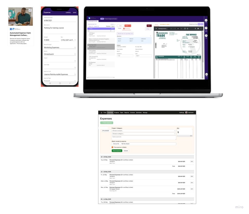
Brief – The Expense Claims application needs to be fast and accurate
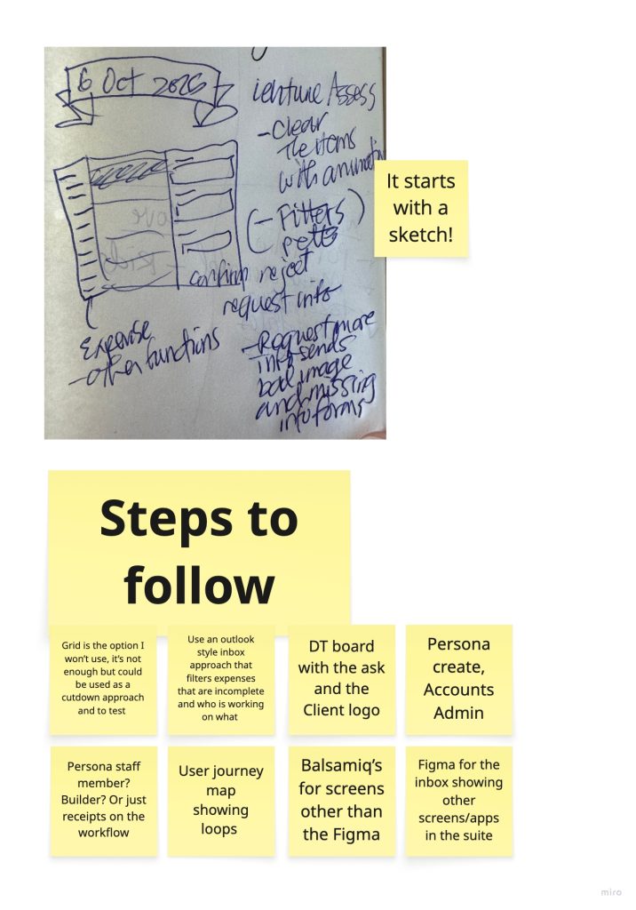
It all starts with a sketch. The ask is: How do you design a screen for Expense Management that gives the user focus around late and incomplete claims?
Allowing my brain to wander I created a sketch based on the Outlook/Inbox style of design. Give the user a list of task items that fit specific criteria rather than making them search:
Personas
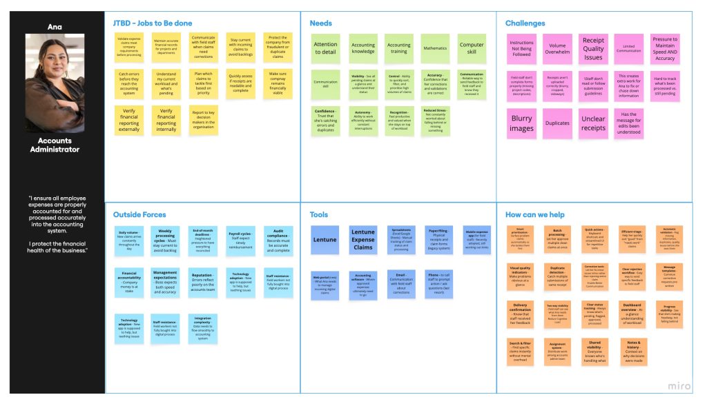
Next, the Persona. An Accounts Administrator typically handles this expense claims review and approval process so I set to work building out this information using Design Thinking.
The Challenge came up multiple times – they need to work quickly and accurately to stay ahead of the flood of claims coming in every day. They also need to be able to share claim items with their coworkers to evenly distribute the workload.
User Journey
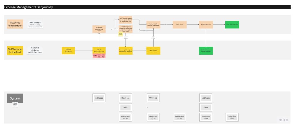
Then the User Journey – there is a lot of back and forth between the Accounts Administrator and employees in the field due to missing and/or incorrect information. I spent some time thinking how to handle this, and one way is an in-app messaging system.
Moodboard
Next to create a moodboard and do some research of other applications function and technical capabilities.
Wireframes
Wireframes help bring together ideas and context with a lack of final polish that says “this is not at all finished and is open to feedback”.
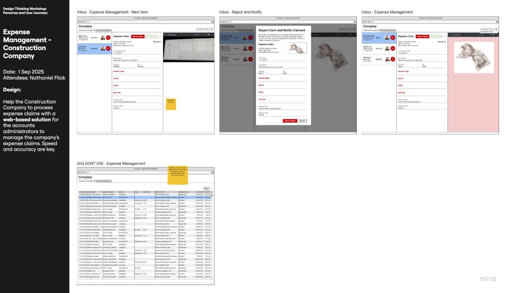
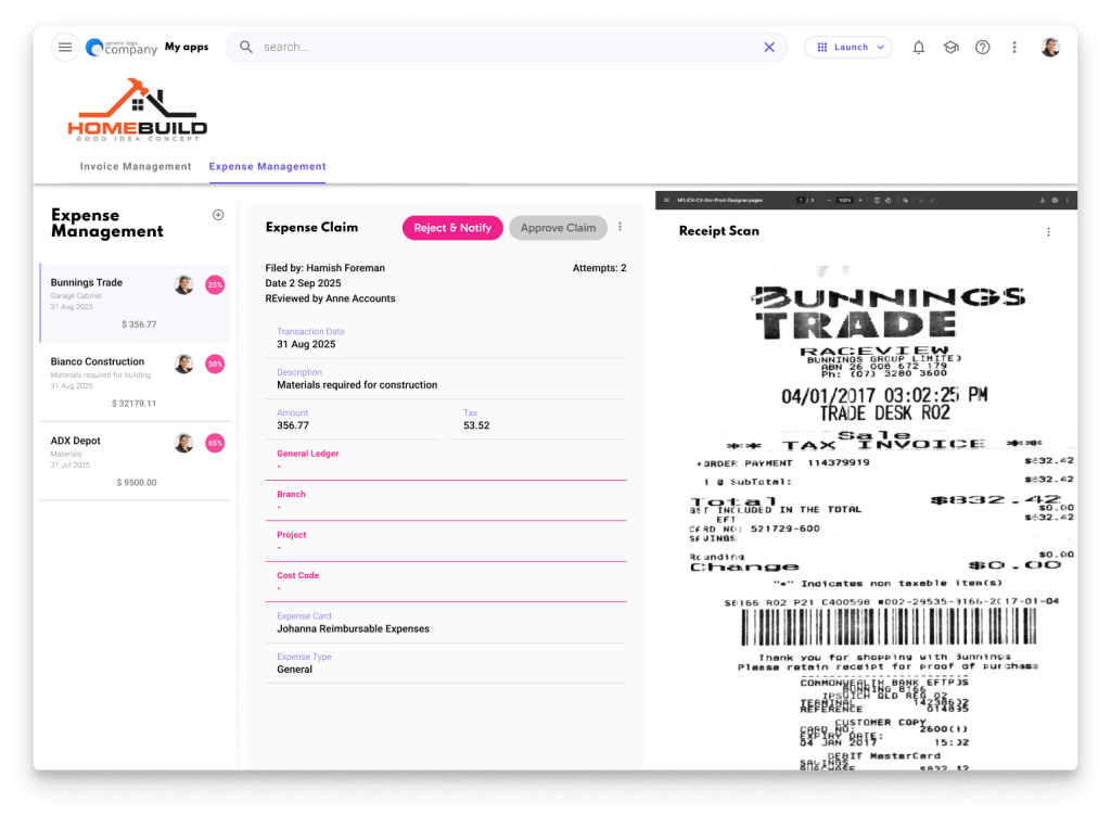
Ana needs an application that makes it easier to review each claim based on Percent Complete (%), # of Attempts to resolve, and monetary value.
Ana decides to Reject the Claim due to the bad receipt scan and missing information so she Notifies the claimaint. The message goes directly to the Claimaint to be resolved.
The item Ana just worked on is now removed from view since it’s out of her queue, and she can then proceed to the ne
It’s always good to come up with other ideas so they can be compared against the best candidate. In this case, a grid for expense claims is not specific or focused enough to help the Accounts Administrator find the ones that are late and incomplete.
UX Audit Report: Expense Claims Redesign
Inbox-Style Interface for Accounts Adminstrator
Step 1: Research Context
User Profile: Ana, Accounts Administrator
Ana represents the primary user segment for this B2B expense management application. Her role demands processing a high volume of expense claims daily while maintaining accuracy and speed.
Key Behavioural Patterns & Pain Points
- Volume pressure: Ana faces a constant flood of incoming expense claims requiring review and approval
- Information gaps: Significant back-and-forth communication occurs due to missing or incorrect claim information (bad receipt scans, incomplete data)
- Workload distribution: Ana needs the ability to share claims with coworkers to balance the team’s processing load
- Priority management: Without clear prioritisation, Ana struggles to identify which claims need immediate attention versus those that can wait
User Needs
- Speed: Process claims quickly without sacrificing accuracy
- Focus: Identify late and incomplete claims without manual searching
- Clarity: Understand claim status at a glance (% complete, attempts to resolve, monetary value)
- Communication: Streamline back-and-forth with field employees to resolve issues
Expected Outcomes
- 25% time reduction in claim processing through focused workflow
- Increased accuracy by surfacing incomplete claims proactively
- Improved team efficiency through workload sharing capabilities
- Reduced friction between accounts team and field employees via in-app messaging
Step 2: Design Question
How effectively does the inbox-style interface reduce claim processing time for accounts administrators like Ana who need to quickly identify and resolve late or incomplete expense claims while maintaining accuracy and enabling team collaboration?
This question is concrete (evaluating the inbox metaphor against traditional grid layouts), connected to Ana’s core goal of speed and accuracy, and framed as a measurable problem to solve.
Step 3: Reason for Change
The inbox-style interface addresses Ana’s cognitive load by applying Serial Position Effect and Progressive Disclosure—presenting one prioritized claim at a time reduces decision paralysis and allows focused attention on resolution. The design leverages Fitts’s Law by placing primary actions (Reject, Notify) near the content area where Ana’s attention is focused. By filtering claims based on completion percentage and resolution attempts, the interface follows Hick’s Law, reducing the number of choices Ana must evaluate simultaneously and accelerating her decision-making process.
Step 4: Define Terms
| Term | Plain Language Explanation |
|---|---|
| Serial Position Effect | People remember and process items better when presented one at a time or in small groups, rather than viewing a long list all at once |
| Progressive Disclosure | Showing only the information needed for the current task, reducing overwhelm and helping users focus on what matters now |
| Fitts’s Law | The time it takes to click something depends on its size and distance—placing important buttons close to where users are looking makes interfaces faster to use |
| Hick’s Law | The more choices presented, the longer it takes to decide—reducing options speeds up decision-making |
| Cognitive Load | The mental effort required to complete a task—good design reduces unnecessary thinking so users can focus on their work |
| Information Architecture | How content and features are organized and structured to help users find what they need |
Step 5: Options Comparison
| Option | Pros | Cons |
|---|---|---|
| Option 1: Traditional Grid View | • Familiar spreadsheet-like interface • Shows multiple claims simultaneously • Easy to scan for specific claim IDs | • Requires manual filtering/sorting • No prioritisation of urgent items • High cognitive load to identify which claims need attention • Slows down processing workflow |
| Option 2: Inbox-Style Interface (Preferred) | • Prioritises late/incomplete claims automatically • Focuses attention on one claim at a time • Clear action hierarchy (Approve/Reject/Notify) • Removes processed items from queue • Reduces decision paralysis | • May feel limiting for users who prefer overview • Requires trust in prioritisation algorithm • Could hide lower-priority items that still need attention |
| Option 3: Kanban Board | • Visual workflow stages • Drag-and-drop feels interactive • Good for team collaboration visibility | • Overwhelming for high-volume processing • Requires more screen real estate • Adds unnecessary steps (dragging cards) • Not optimised for speed |
| Option 4: Dashboard with Widgets | • Customisable views • Shows multiple metrics simultaneously • Flexible for different user preferences | • Requires setup time and user configuration • Lacks focused workflow • Can become cluttered and overwhelming • Doesn’t enforce prioritisation |
Step 6: Detailed Analysis of Each Option
Option 1: Traditional Grid View
Implementation: Standard table with columns for claim details, sortable headers, and row selection.
Edge Cases:
- What happens when 100+ claims appear in the grid? Users must manually identify priorities
- How does Ana know which claims her coworkers are working on to avoid duplication?
Technical Feasibility: Low effort—most systems already use this pattern.
Risk/Dependency: High risk of continued inefficiency; doesn’t solve the core problem of Ana being overwhelmed by volume and unable to prioritise.
Effort vs Reward: Low effort, low reward. This maintains status quo frustrations.
Option 2: Inbox-Style Interface (Preferred)
Implementation: Queue-based system with smart filtering that surfaces claims by:
- Completion percentage (lowest first)
- Number of resolution attempts (highest first)
- Monetary value thresholds
- Days overdue
Edge Cases:
- Happy Path: Ana reviews claim → Rejects with message → Item leaves queue → Next prioritised item appears
- Unhappy Path: What if Ana needs to revisit a rejected claim? Need “Sent Items” or “History” view
- Unhappy Path: What if no claims meet the “late/incomplete” criteria? Show “All caught up!” state or default to standard queue
- Collaboration: How does workload sharing work? Need ability to assign claims or mark as “In Progress” to prevent duplicate work
Technical Feasibility: Medium effort—requires:
- Prioritisation algorithm development
- Real-time queue updates
- In-app messaging system integration
- State management for claim status
Risk/Dependency:
- Depends on accurate claim metadata (completion %, attempts)
- Requires buy-in that single-item focus is better than overview
- May need user testing to validate prioritisation logic
Effort vs Reward: Medium effort, high reward. Directly addresses Ana’s primary pain points and achieves the 25% time reduction goal.
Option 3: Kanban Board
Implementation: Columns for stages (Submitted → Under Review → Awaiting Info → Approved/Rejected), draggable claim cards.
Edge Cases:
- How are cards prioritized within each column?
- With dozens of daily claims, columns become scrollable lists (defeating the purpose)
- Moving cards adds interaction time versus quick approve/reject buttons
Technical Feasibility: Medium-high effort—requires drag-and-drop library, state management, real-time updates for team visibility.
Risk/Dependency: High risk of overwhelming Ana with too much visual information; designed for project management, not high-volume transactional work.
Effort vs Reward: High effort, low reward for Ana’s specific use case.
Option 4: Dashboard with Widgets
Implementation: Customizable dashboard with widgets for metrics (claims by status, overdue items, team workload), plus embedded grid or list views.
Edge Cases:
- Requires each user to configure their preferred layout
- Different team members may have inconsistent views, complicating collaboration
- Widget overload can recreate the overwhelm problem
Technical Feasibility: High effort—dashboard framework, widget library, user preferences storage, complex state management.
Risk/Dependency: Risk of decision fatigue during setup; paradox of choice may lead to suboptimal configurations.
Effort vs Reward: Very high effort, uncertain reward. Adds flexibility but doesn’t enforce the focused workflow Ana needs.
Step 7: Recommendation Summary
I recommend Option 2: The Inbox-Style Interface as the optimal solution. This approach directly applies Hick’s Law and Progressive Disclosure to reduce Ana’s cognitive load by presenting one prioritized claim at a time, eliminating the paralysis of choice inherent in grid views. The research shows Ana’s primary challenges are speed and accuracy under volume pressure—the inbox pattern addresses both by automatically surfacing late/incomplete claims and creating a focused, linear workflow that guides her through resolutions efficiently.
Additional Considerations for Portfolio Presentation
Strengths of Current Design
- Clear visual hierarchy with claim details and actions grouped logically
- Smart use of metadata (%, attempts, value) for prioritization
- In-app messaging solves the documented back-and-forth pain point
- “Next item” auto-advance maintains workflow momentum
Opportunities for Enhancement
- Workload Sharing: The persona mentions needing to distribute work amongst coworkers, but the wireframes don’t show how Ana assigns or shares claims
- Unhappy Path Documentation: Consider showing what happens when Ana needs to revisit a rejected claim or when the queue is empty
- Success Metrics: Add how the 25% time reduction will be measured (claims per hour, average resolution time, etc.)
- Alternative View Access: Show how Ana can switch to grid view if needed for specific scenarios (searching for a particular claim ID, end-of-month reporting)
Portfolio Positioning
This case study effectively demonstrates:
- User-centered design thinking (persona, journey mapping)
- Research-informed decision making
- Exploration of alternatives before committing to a solution
- Understanding of cognitive psychology principles in UX
To strengthen it further for potential employers, consider adding brief rationale for why the grid view doesn’t work using your UX principles framework, rather than just stating it’s “not specific or focused enough.”
Report compiled following the UX Audit Framework by Nathaniel Flick