Outcomes
- Project: Habitat by Resene
- Description: Design and build a new custom Python site for the client (while working at Image Centre). Do all design and front-end development work.
- Product type: Consumer Home Decorating
- Longevity: Site has been live and going strong for more than 10 years.
- Team: Image Centre (now SCG)
- Team size: 3
- Tech: Foundationn 6, Masonry, Wistia, Python, SCSS/CSS, Bourbon
Maths-based design for optimal responsiveness
I used my high school maths
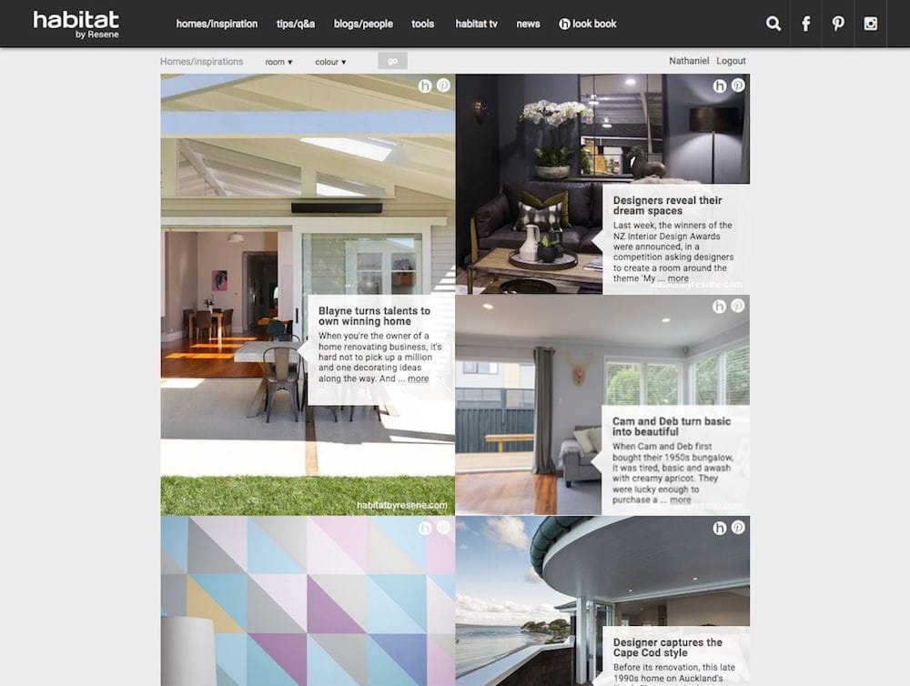
The brief was deceptively simple: create a layout that looked perfect on every screen, with no gaps, no wasted pixels, and no awkward negative space. I started dividing and multiplying, looking for harmony in multiples of 200 pixels: small, medium, and large blocks that could tessellate with architectural precision. It wasn’t just responsive design; it was geometry as art direction.
Working with a small, tight-knit team of three at Image Centre, we built the system in Python (Django), layering CSS media queries and Masonry like a digital jigsaw. Each block snapped into place, forming a fluid, almost musical grid that adjusted itself to the rhythm of every viewport.
Our collaboration was equal parts logic and laughter — the kind of project where someone might say, “It’s not just maths, it’s décor,” and everyone would nod, knowing exactly what they meant. By the end, what began as numbers on paper had become a living, breathing home for colour inspiration and creative energy.
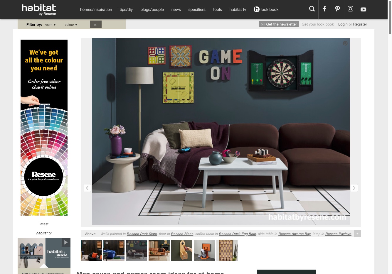
More than a decade later, the site is still online. It’s still symmetrical, still useful, still quietly doing its job, though recently it’s been redesigned using CSS Grid to ostensibly improve performance, it’s lost a little of its charm and sophistication.
It’s rare for digital work to age this well, and I think that endurance speaks to what we built: not just a website, but a framework with purpose and soul. The grid has evolved, CSS has taken over some of the heavy lifting, but the foundation of the maths, the craft, and the intention behind it remains the same. And honestly, that makes me smile every time I see it.
The design worked with very specific breakpoints
Here’s the responsive breakpoint math I used. The restrictions were clear that we needed to have statically-sized blocks and they needed to line up regardless of the width of the screen. There can be no empty spaces on the home page.
I got to work with pencil and paper and came up with a mathematical system so no matter what screen size there would always be symmetry. I used a 200px wide multiple and created small, medium and large blocks with this. Then I could use masonry to put the blocks in the right places so there were no gaps.
The responsive breakpoint maths:
| Breakpoint | Max Container Width | Column Calculation | Gutters | Effective Content Width | # of 200px Items |
| >1400px | 1200px | N/A (max reached) | ~0px sides | ~1200px | 6 items |
| ≤1400px | 1200px | Static max | ~0px sides | ~1200px | 6 items |
| ≤1199px | 1000px | Static max | ~0px sides | ~1000px | 5 items |
| ≤999px | 800px | Static max | ~0px sides | ~800px | 4 items |
| ≤799px | 600px | Static max | ~0px sides | ~600px | 3 items |
| ≤599px | 400px | Static max | ~0px sides | ~400px | 2 items |
| ≤399px | 320px | Static max | ~0px sides | ~320px | 1-2 items* |
The Maths for items per row:
Items per row = floor(Container Width / 200px)

1200px ÷ 200px = 6 items
1000px ÷ 200px = 5 items
800px ÷ 200px = 4 items
600px ÷ 200px = 3 items
400px ÷ 200px = 2 items
320px ÷ 200px = 1.6 items (rounds to 1, but allows 2 at ~160px each)
Key Pattern:
- I used 200px steps for most breakpoints (1200→1000→800→600→400)
- Final jump is 80px (400→320) for mobile
- Each breakpoint cleanly divides by 200px base unit
- At ≤1240px and ≤660px, the .row switches to percentage-based: max-width: 95% and max-width: 100%.
This created a fluid masonry grid that snapped to exact multiples of the 200px item base block width at each breakpoint.
Maths is used for design all the time
Normally, design is based on maths, but it’s relational and functional rather than exact. In this case I got to craft a very strict mathematic algorithm so the layout would always work, no matter what screen size.
After that we could then add different content like advertisements and colour blocks, and use the Django system in the back end to provide objects based on filters the user selects like colour and room type.
The site stands the test of time
Besides the change to CSS Grid sometime in the past few years, the website is still going, which I think is a testament to its usefulness. I’m grateful to the Image Centre team I worked with to make this design happen.
See the current website at habitatbyresene.co.nz