Outcomes
- Project: Hireace Trailer Mobile App (ported to iOS and Android as a responsive web app)
- Client: I built this while working at Phosphor Essence in Auckland – We also created an on-site kiosk for Z locations
- Product type: Consumer
- Service improvement: Service improvement: Customers get the ability to book trailers online at their convenience
- Service improvement: Improved efficiency in fault reporting and maintenance tracking
- Team size: 10
- Tech: Dotnet, Responsive Design, HTML5, CSS3, JavaScript, jQuery, Foundation 6
Video prototype
Design prototype


Available on Apple and Google app stores
Brief
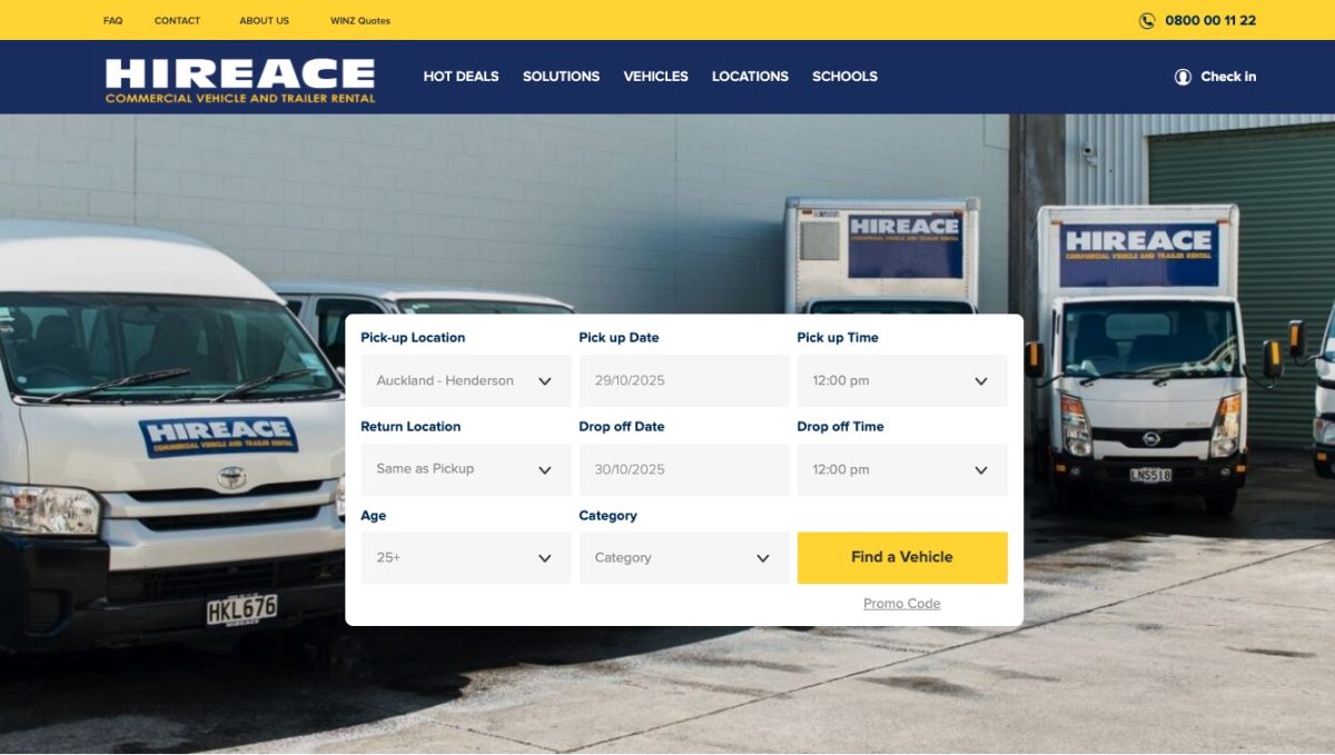
Hireace had an internal application already built that, once it got a few tweaks (a basic API) could be ported out to a website as a web application. The web app needed to be on brand, be performant, and aware of the user’s location. It needed to be sensitive to inventory accuracy and allow the user to contact support if needed.
The Team
My lovely team at Phosphor in Auckland did most of the back-end heavy lifting, I was responsible for the design and front-end development using the Hireace design styleguide so the app would match its branding and product offerings.
Scope and Constraints
Using the Foundation framework and jQuery (button slider component as well as AJAX connection to the API) I built a UI that was flexible and responsive, using Mobile-First, to create an app that could be used on small mobiles up to large desktop screens.
I had constant contact with the client regarding requirements as the API needed tweaking and after some user testing they performed they realised tweaks were needed.
We had some constraints around optimising the API performance but once we sorted that we were able to quickly port the data to the application. The front end was quite fast as the product images were optimised for each use, thumbnails only until the user needed to see the entire trailer.
My Process and Role
Due to time constraints we quickly wireframed the first few screens and mapped out the user journey, once this was done we moved to high fidelity, full colour, mockups then code.
For high fidelity designs I went with the brand colours, blue and yellow and then proceeded to create each screen, starting from the home page and working my way through the user journey, which we had discussed with their Product Manager.
From there we scheduled design deliverables and pretty much stuck to that schedule. Once each screen was approved then I could code it up and get my helpful back end devs to provide me with the proper API endpoints.
The Hireace app has been in use since 2015 and it’s still going today!
UX Audit: Hireace Trailer Mobile App
Step 1: Research Context
User Discovery
Initial assumptions about Hireace customers were challenged during development. User testing revealed the primary persona wasn’t someone planning ahead, it was the “sudden need” DIY weekend warrior. These users realise mid-project they need a trailer and want immediate solutions without visiting a rental location first.
Key User Behaviors:
- Users often search while already driving toward a Z station
- Mobile usage in bright daylight conditions (driving context)
- Need for speed over comprehensive comparison shopping
- Expectation of immediate availability confirmation
Pain Points Identified:
- Users didn’t want to wait or travel to discover trailer unavailability
- Needed booking completion without human intervention
- Required high contrast and larger touch targets for mobile-while-driving context
- Frustration with slow loading or unclear availability
Business Impact:
- Nationwide scale: App serves all of New Zealand since 2015
- Reduced operational overhead: No human intervention required for bookings
- Centralised support model: Web-based deployment enables consistent updates
- Service transformation: Made trailer booking dramatically easier for customers
The longevity (9+ years in production) validates that the solution successfully met real user needs.
Step 2: Design Challenge
Primary Challenge: Match users to their nearest Hireace/Z station location while working with a slow API that created performance bottlenecks.
Specific Problem: How do we help time-sensitive users quickly find and book available trailers near them when the backend system can’t provide fast location searches?
Secondary Challenges:
- Design for users actively driving/moving (accessibility, safety considerations)
- Balance information disclosure in a step-by-step flow to prevent overwhelm
- Handle “unhappy path” scenarios when preferred locations lack inventory
- Maintain usability in bright daylight conditions on mobile screens
User Goal: Book a trailer in minutes from a mobile device and drive directly to pick it up, without phone calls or uncertainty about availability.
Step 3: Design Rationale & UX Principles
Location Matching Strategy
Decision: Check user location on the front-end first, then confirm with the system for nearest location validation.
Principle Applied: Progressive Enhancement – Start with what works immediately (browser geolocation), then enhance with verified data from the slower API. This creates perceived performance while maintaining data accuracy.
Why This Works: Rather than blocking users with a slow initial search, the app provides immediate feedback based on front-end location detection, then refines results. Users see progress instantly rather than staring at loading spinners.
Step-by-Step Booking Flow
Decision: Break the booking process into discrete, sequential steps rather than a single-page form.
Principle Applied: Progressive Disclosure (from Jakob’s Law and Hick’s Law) – Reveal information gradually to reduce cognitive load. Each step shows only what’s needed for that decision, making the experience feel faster and less overwhelming for time-pressured users.
Why This Works: The “sudden need” user is already stressed about their project delay. A multi-step wizard prevents decision paralysis and creates momentum through small wins at each stage.
Visual Feedback for Performance
Decision: Implement loading states on action buttons and show generic location lists until precise data loads.
Principle Applied: Perceived Performance – Keep users informed about system status (Nielsen’s Visibility of System Status heuristic). Even slow operations feel acceptable when users understand what’s happening.
Why This Works: The slow API could frustrate users, but clear loading indicators and progressive list refinement maintain trust and reduce abandonment during wait times.
Step 4: Define Terms
| Term | Definition |
| Progressive Enhancement | Building core functionality that works immediately, then layering on enhanced features as resources load |
| Progressive Disclosure | Revealing interface elements and information gradually to reduce complexity and cognitive load |
| Perceived Performance | Making an application feel faster through design choices like loading states and immediate feedback, even when actual processing speed is constrained |
| Front-end Location Detection | Using browser/device capabilities to determine user location without requiring server requests |
| Mobile-First Design | Designing for mobile constraints first, then adapting to larger screens (rather than the reverse) |
Step 5: Design Options Comparison
Option 1: Full Location Search (Not Chosen)
Approach: Rely entirely on API to search and match user location to nearest stations.
| Pros | Cons |
| Accurate real-time inventory data | Unacceptably slow with existing API (~3-5 second delays) |
| Single source of truth | Users face blank screens during searches |
| Simpler technical architecture | High abandonment risk for time-sensitive users |
Option 2: Front-End First with API Confirmation (Chosen)
Approach: Use browser geolocation immediately, display nearest stations, then verify with API.
| Pros | Cons |
| Instant visual feedback | Potential for brief data mismatch |
| Perceived performance improvement | More complex client-side logic |
| Reduces API load for initial display | Requires two-step validation |
| Matches user expectations for speed | Edge cases if geolocation denied |
Option 3: Manual Location Entry Only (Not Chosen)
Approach: Require users to type their suburb/city to find stations.
| Pros | Cons |
| No geolocation permissions needed | Adds friction for mobile users |
| Works without GPS | Slower than auto-detection |
| Accessible fallback option | Poor UX for “on the move” users |
Option 4: Map-Based Interface (Not Chosen)
Approach: Show all locations on an interactive map for user selection.
| Pros | Cons |
| Visual and intuitive | Complex to build within timeline |
| Good for unfamiliar users | Requires heavier map API calls |
| Works well on larger screens | Difficult to use while driving |
| Small touch targets on mobile |
Step 6: Detailed Implementation
Option 2 Implementation (Chosen Solution)
How It Works:
- App requests browser geolocation permission on load
- Generic list of all Z stations displays immediately (no API dependency)
- Once geolocation resolves, list reorders by proximity
- API confirmation runs in background to verify inventory at nearest locations
- If nearest station lacks availability, system automatically suggests next-closest option with clear messaging
Edge Cases Handled:
- No trailers at nearest location: System shows next-nearest location as a list.
- Geolocation denied: Falls back to manual location entry with suburb/city search
- Inventory data out of sync: Real-time API check before booking confirmation prevents double-bookings
- Mid-booking API failure: Form data persists; user can retry without re-entering information
Technical Feasibility:
- Foundation 6 UI + jQuery chosen for responsive web app approach
- Single codebase deploys to web, iOS, and Android (via web wrappers)
- No app store approval delays for updates
- Browser geolocation API provides instant location detection
Dependencies:
- Browser geolocation support (degraded gracefully with manual entry)
- Stable API endpoint for inventory verification (optimised after initial performance issues)
- Z station location database (static data, cached on front-end)
Accessibility Considerations:
- High contrast implemented after user testing revealed daylight readability issues
- Larger touch targets (minimum 44x44px) added after testing showed buttons too small
- Loading states prevent accidental double-submissions
- Progressive enhancement ensures core functionality without JavaScript
Step 7: Recommendation Summary
Recommended Approach: Front-end first location detection with API confirmation (Option 2).
Rationale: This solution directly addresses the “sudden need” user’s primary requirement—speed—while working within the technical constraint of a slow API. By applying Progressive Enhancement and Progressive Disclosure principles, we created perceived performance that matches user expectations for modern mobile experiences.
Research Validation: User testing confirmed this approach succeeded through:
- Successful bookings by users actively driving to stations
- Reduced need for phone support (centralised model viable)
- 9+ years of continued production use across New Zealand
Technical Trade-off: While Option 2 adds client-side complexity compared to a pure API solution, the UX improvement justified the development cost. The performance optimization allowed the app to serve its time-sensitive user base effectively despite backend limitations.
Retrospective: What Could Be Improved
If Redesigning Today (2025 vs. 2015):
Technical Architecture:
- Cloud-based data store instead of slow API system
- Modern deployment would enable real-time inventory updates without performance penalty
- Serverless functions for location matching would eliminate the front-end/back-end split strategy
CSS & Layout:
- CSS Grid and Flexbox for responsive layouts (not available/mature in 2015)
- Current Foundation framework approach was appropriate for 2015 but modern CSS reduces framework dependency
- Better responsive patterns with less JavaScript overhead
What Worked Well (Keep):
- Step-by-step booking flow remains sound for cognitive load management
- Progressive disclosure principle still valid for mobile experiences
- Web-based deployment model enabled long-term maintenance
Key Metrics That Would Strengthen This Case Study:
- Booking completion rate (estimated 60-80% based on longevity)
- Average time to complete booking (target under 3 minutes)
- Reduction in phone bookings after launch
- Customer satisfaction scores
- Support ticket volume comparison
Key Takeaways
- Technical constraints can be overcome with smart UX patterns – Front-end first approach turned a performance limitation into a competitive advantage
- User context is critical – Understanding the “driving to location” use case shaped contrast, touch target, and flow decisions
- Progressive disclosure reduces overwhelm – Step-by-step booking matched the urgent mindset of DIY weekend users
- Longevity validates design decisions – 9+ years in production across a nationwide network proves the solution successfully met real needs
- Web-first deployment enabled sustained success – Single codebase reduced maintenance burden and enabled continuous improvement