
Get the text rhythm right, and add in visual landmarks and you’re on the way to increased comprehension and a better user experience. Start with the fundamentals for easily scannable text.
I’m a musician so I love Better Typography’s description of what text rhythm is:
Rhythm in typography is just like rhythm in music. A text can either flow like a masterpiece symphony performed by an in-tune orchestra, or it can be a disjointed flimsy song by a one-man band wannabe. Just like in music, where order is more pleasurable to our ears than chaos, so is a well-designed text with an established rhythm easier to read and more enjoyable to consume by our eyes. Ears and eyes are just the sensory tools; it’s our mind that processes the information. And our mind is a machine for pattern recognition. That’s why a well-tuned, rhythmic and proportional text will always triumph over a scrappy one. But, unlike in music, there are two types of rhythm in typography: horizontal and vertical.
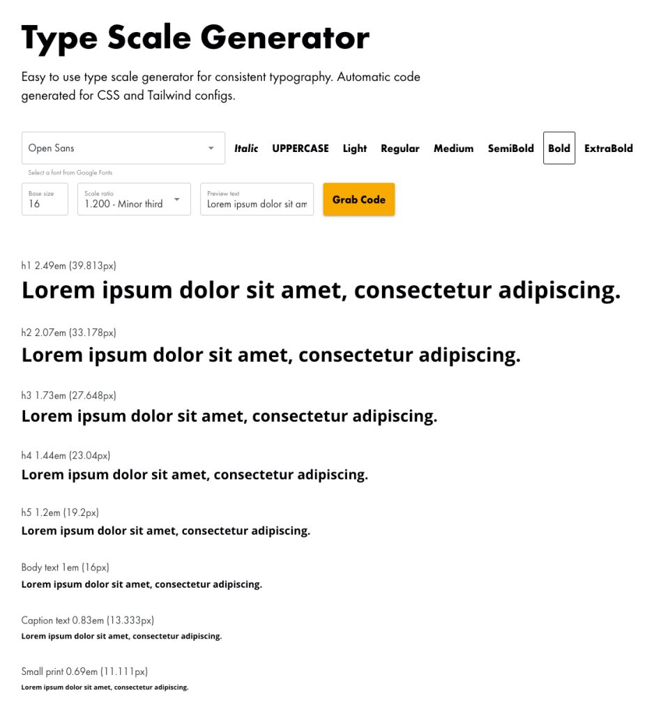
To start working with text rhythm, try this great online tool: Type Scale Generator
Get the text rhythm right and the user is put at ease. Get it wrong, and they will notice something’s wrong, but most likely not know exactly why. Let’s all clap on two and four, designers! We must design text with serious intention.
It’s important to get this right. So how do you go about it? Design it! Start with a clear hierarchy for titles.
Visual Hierarchy for Titles
Use clear heading structures and white space to communicate to the user where they can scan with their eye to get what they need.
Make sure every page has H1-6 title in the HTML. A user gets to a page and starts top left (unless their language is right to left (RTL) in which case they most likely will read their language from the right). Don’t use too much bold in text, only emphasise really important words. You don’t want to distract from the titles and the rest of the content.
Here’s an example of the six title sizes followed by body text using “Minor Thirds” spacing algorhythm:
There’s a pattern of reading called “F-Pattern Reading” which means we scan down a page and stop on section titles (vertically). Then, when we find the subject we want, we scan across its content (horizontal).
White space
White space is critical to a user comprehending text. If words and paragraphs are too close together, F-Pattern Reading becomes more difficult and your user will lose interest. The trick with white space is to give just enough room between letters, words, and paragraphs to make the reading experience really pleasing.
It’s a bit of a balancing act, but start with defaults and then tweak from there. Definitely don’t start with the tweaking part or you will lose sense of where your baseline was.
Content Structure
Break up long paragraphs into shorter blocks of 2-4 sentences maximum. Dense walls of text intimidate readers and make them likely to abandon the content entirely.
Use bullet points and numbered lists for information that naturally fits this format, such as features, steps, or key points. Lists create natural stopping points for the eye.
Lead with the most important information in each section. Put your main point first, then follow with supporting details. This front-loading technique helps scanners quickly determine if they want to read deeper.
Typography and Formatting
Choose high-contrast color combinations like dark text on light backgrounds. Avoid low-contrast combinations that strain the eyes during scanning.
Use bold text sparingly to highlight key terms or phrases within paragraphs. Too much bold text loses its impact and creates visual noise.
Implement consistent typography with a readable font size (typically 16px or larger for body text) and fonts that render clearly across devices.
Scannable Elements
Write descriptive subheadings that tell readers exactly what they’ll find in each section. Vague headings like “More Information” don’t help scanners navigate effectively.
Include summary boxes or callouts for key takeaways. These visual elements catch the eye and provide quick wins for busy readers.
Use meaningful link text that describes the destination rather than generic phrases like “click here” or “read more.”
Mobile Considerations
Design for thumb-friendly interaction with adequate spacing between clickable elements and text that remains readable without zooming.
Test your content on various screen sizes to ensure the scanning experience remains effective across devices.
Remember that a mobile screen is smaller so it’s perfectly ok (and highly recommended) to increase the size of body copy there. If your desktop font size is 16px try 18px for mobile. Tweak this to taste. Above all else don’t make it hard for the user to read your text.
The goal is creating a visual pathway that allows readers to quickly identify relevant information while maintaining the option to dive deeper when something catches their interest.
Accessibility
Last but not least the end result of all this careful text design is increased accessibility! Low sighted users will appreciate larger text (and being able to zoom your site to up to 400% without breaking it!).
Make your text content easy to find by screenreaders. Use a Skip Link so a screenreader user can land on your page then jump right to the main content without having to jump through everything that comes before it (navigation, other content, sidebars, etc.)
I’m a keen proponent of Accessibility so if you’re curious please have a look at my other posts on this topic.
Text is important
Text is a large portion of the internet and applications so it’s vital that you design it to be readable. Then it’s more useful, more accessible and more interesting to read. Give the user a good reading experience by designing your text for scannability.