Designer. Developer. I like being a little bit of both.
What matters now is bridging the gap between them. Figma is making strides in this area, but there are still gaps that it doesn’t address. One is token systems – code is systematic but Figma’s tokens are not, they are 1:1.
Reduce the pain
Never fear, there’s a way to reduce the pain between a design and turning it into a workable code prototype (or even a real product!) These days it doesn’t mean spending weeks learning terminal commands, package managers, and complex JavaScript frameworks.
But with AI in your corner, you can bypass the developer setup anxiety and spin up functional, native web prototypes entirely on your own terms. The secret isn’t knowing how to code—it’s knowing how to drive the AI so it writes the clean, standard code you actually need.
Go faster with a workflow
Here is a step-by-step workflow to take your designs from Figma layers to interactive web realities. I use this to quickly iterate and test ideas; AI is like putting on a robot suit a la Edge of Tomorrow with Tom Cruise (when he finally starts getting to know how the suit works!)
1. Create a Pixel-Perfect Design in Figma

Before you even think about talking to an AI, you need to establish your visual truth, your design system. AI is incredibly smart, but it works best when it reads a documented structure. If your Figma file is a chaotic wasteland of “Vector 412” and “Frame 97,” the initial code generation is going to struggle to interpret your intent.
A documented structure is key
The Trick: Build like a professional. Use modern Figma practices like Auto Layout, proper layer naming, and components. Think of Auto Layout as your visual training wheels for the web—if it responds beautifully inside Figma, the AI will have a much easier time translating it into clean code.
Get to know web terms like Grid and Flexbox. These modern layout techniques are the key to converting a design to code in a way that’s more likely to actually be used:
| CSS Layout | Description |
| Grid | Great for page layout |
| Flexbox | Great for component layout |
I lean on the MDN web specification documents here and get my AI agent to check its work against it. Checking compliance to structure is your job but AI makes this easy. There are also JavaScript plugins you can draw on, and we’ll discuss these shortly.
2. Send it to Figma Make
Once your design is locked down, it’s time to hand the layout off to the AI translator. Whether you’re using Make or another modern design-to-code tool, you’re essentially feeding your visual layers into an engine that maps out structural semantic blocks. Don’t worry if it doesn’t look 100% identical on the first pass—we’re just establishing the baseline skeleton here.
Keep in mind also that Make uses React and Tailwind by default – these libraries aren’t always necessary for a function mockup (unless this framework combination is your goal) so I remove them as soon as I get to editing the exported code, if at all possible.
3. Tweak and Refine in the Visual Interface
Before you look at a single file or a line of raw text, use the tool’s visual interface to smooth out the rough edges. Fix any alignment discrepancies, tweak your spacing variables, and map your visual design elements to interactive pieces. This is where you tell the system that a specific static rectangle group isn’t just a box—it’s an actual, clickable button.
It might sound impersonal, but it’s crucial that you systemise your design so AI can understand it. AI is all about wielding patterns to get what you want.
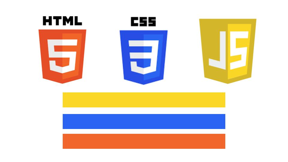
4. Export to “Vanilla” Web Code (HTML, CSS, JS)
When you’re ready to download your project, this is where you need to put your foot down with the AI or the export settings. You want “Vanilla” code.
For example, tell the system:
“No Tailwind, no React, and zero build tools.”
Traditional developers love complex modern frameworks that require a terminal, infinite packages, and complex “tooling” just to see a single button render on a page. You don’t need that overhead. You want pure, standard HTML (the skeleton), CSS (the skin), and JavaScript (the muscle). Code that runs instantly the moment you double-click the file.
Once you get more comfortable you can start bringing things in like Webpack to run a local server that auto-reloads when you change code.

5. Load and View Locally
Time to see your creation live in your local web browser. Create a dedicated project folder on your computer, usually in your /Documents (PC) or /Sites (Mac) folder, or any folder you know is accessible and not locked down (some folders like system folders have very strict permissions which means you can’t load files into a browser from these folders), and drop your downloaded files right into it. Organise these experiments in separate folders, named in a way you can remember them.
The mighty index HTML file
To view your prototype, simply drag your index.html file directly into any browser window (Chrome, Safari, Edge). Boom—you are running a live, local web prototype straight from your hard drive, completely independent of the cloud. For now, without a local server, you see changes by refreshing the browser manually.
Your index.html file references a .css file and a .js file, sometimes called styles.css and main.js.
Tame your layouts
It’s crucial to come to an understanding, especially, around page layout. This is where a lot of misunderstandings occur between human and AI.
Here are some tenets to start with so you are both on the same page:
# AI Prompting Framework for Designers: CSS Layouts

This guide provides concrete semantic rules to pass to an AI assistant when generating or modifying coded mockups. It ensures the AI builds clean, professional layouts without messy CSS hacks.

---

## 1. The Core Layout Rule (Grid vs. Flexbox)

Always explicitly tell the AI when to use CSS Grid versus Flexbox.

* **Rule:** Use **CSS Grid** for macro layout (the overall page structure, page columns, major sections). Use **Flexbox** for micro layout (components, navigation bars, alignment inside cards, button groups).
* **Prompt Snippet to copy:** > "For the layout, use CSS Grid for the overall page structure and multi-column layouts. Use Flexbox for component-level layouts, item alignment, and content flow inside components."

---

## 2. Component Layout Rules (Flexbox Control)

To stop AI from using margins to randomly push items apart, force explicit Flexbox spacing rules.

* **Rule:** Always use the CSS `gap` property for spacing elements within a flex container. Never allow arbitrary margins for structural spacing.
* **Prompt Snippet to copy:**
    > "When aligning items inside a component with Flexbox, use explicit alignment properties (`justify-content`, `align-items`) and control element spacing strictly using the `gap` property. Do not use random margins to space items out."

---

## 3. Layering & Overlaps (Relative & Absolute)

When UI elements must overlap (e.g., notification badges, close buttons on cards, photo tags), force the AI to establish a strict parent-child relationship.

* **Rule:** Always position overlapping child elements using `position: absolute` trapped inside a parent element set to `position: relative`.
* **Prompt Snippet to copy:**
    > "For overlapping UI elements (like a badge on a card), ensure the parent container is set to `position: relative`, and the overlapping child element is targeted using `position: absolute` so it maps precisely to its parent boundary."

---

## 4. Sizing Controls (Preventing Squishing)

Prevent the AI from creating fragile, rigid pixel widths that break on different screen sizes.

* **Rule:** Use fluid sizing (`100%`, `max-width`, `min-width`) and leverage `flex-shrink: 0` to protect static icons or elements from collapsing.
* **Prompt Snippet to copy:**
    > "Ensure all component containers are fluid and responsive using `max-width` rather than fixed pixel widths. For elements that should never squish or distort (like icons or avatars), explicitly apply `flex-shrink: 0`."

## All the prompts in one place:

> "For the layout, use CSS Grid for the overall page structure and multi-column layouts. Use Flexbox for component-level layouts, item alignment, and content flow inside components."
> "When aligning items inside a component with Flexbox, use explicit alignment properties (`justify-content`, `align-items`) and control element spacing strictly using the `gap` property. Do not use random margins to space items out."
> "For overlapping UI elements (like a badge on a card), ensure the parent container is set to `position: relative`, and the overlapping child element is targeted using `position: absolute` so it maps precisely to its parent boundary."
> "Ensure all component containers are fluid and responsive using `max-width` rather than fixed pixel widths. For elements that should never squish or distort (like icons or avatars), explicitly apply `flex-shrink: 0`."
6. Set Up a Safety Net (Initialise Git with AI)
Before we start changing things, we need a time machine. Open your project folder in a code editor like VS Code, open up your AI chat assistant (like GitHub Copilot), and type:
“Help me initialise Git for this project.”
What is Git?
Git is free and open-sourced and used by 96% of developers worldwide. In more detail:
Think of Git as a highly advanced “undo” button combined with a digital time machine for your project files.
Git sounds like developer-only territory, but think of it simply as Figma’s “Version History.” It creates a secure snapshot of your project. If you try to add an advanced feature later and completely break the entire page, you don’t have to hit Command/Control + Z four hundred times. You just roll back to this exact checkpoint with a single click.
If your local AI does something that doesn’t work, you can use this git command or tell AI to use it to start over (all uncommitted changes are removed forever):
git reset –HARD
What I’ve found when vibe coding is my agent will sometimes forget what “go back one step” actually means, and we lose our way. With Git you make changes methodically, and when something goes wrong you can start over without losing all your work. It’s vital to save your work step by step as AI gets it right.
(This is how developers work!)
7. Feature Building — One Bite at a Time
The Mindset: Feed the Beast, But Feed It Slowly

AI is incredible, but it has the attention span of a puppy in a tennis ball factory – eager to please while also bumping into walls and falling over. If you hand it an entire Figma board and ask it to “make the app interactive,” it’s going to trip over its own shoelaces. It will hallucinate, overwrite perfectly good logic, and leave you staring at a blank screen wondering where your afternoon went.
Instead, we treat feature building like micro-tickets. One bite at a time. Pick an exact, isolated interaction—like a mobile burger menu sliding in from the right—and get that working flawlessly before you move on.
Now you’re thinking like a developer. 🙂
We also need to put up concrete guardrails around responsive design. AI left to its own devices will write layouts that look pristine on a massive ultra-wide monitor and absolutely shatter the moment they hit an iPhone screen. We have to tell it exactly how we want things to break.
As an example for responsiveness of a layout what I normally say is:
“on large screens, 1200px and up, the layout is three columns. On medium sized screens down to 800px the layout is two columns. On small/mobile device screens up to 600px the layout is single column.”
🛠️ Prompt Blueprint: Dropping a New Feature into the Mix
After you’ve set the stage with CSS Grid and Flexbox (see the prompts above), copy this, fill in the brackets, and give your AI assistant some strict boundaries:
I want to add ONE single interactive feature to my layout. Let's keep it clean, focused, and completely vanilla.

THE FEATURE:
[Describe your micro-interaction here. E.g., "A sticky navigation bar that shrinks and changes background opacity when the user scrolls down past 50px."]

YOUR BOUNDARIES:
1. Don't touch unrelated code. Leave the existing structural HTML and CSS alone unless absolutely necessary to make this single feature work.
2. Deliver this in standard web code only. No frameworks, no Tailwind, and no npm installers. Pure, clean HTML, CSS, and JS that runs straight out of the box.
3. If you're adding new CSS, stick it at the absolute bottom of the existing stylesheet inside a clearly labeled comment block like `/* --- New Feature: Sticky Nav --- */`.
4. Keep it responsive. Test this code against standard breakpoints before showing me (for example only, your breakpoints may vary):
   - Mobile: 320px - 480px
   - Tablet: 481px - 768px
   - Desktop: 769px and up

Give me a quick two-sentence summary of how you built it, and tell me exactly which lines to paste into which files.
To go even faster use a code editor like Visual Studio Code and install CoPilot. It will cost some money to run, but you can move much faster when you remove copy/paste from the workflow.
8. Enforce Web Standards (The MDN Rule)
The Mindset: Guarding the Layout Against 2012 Code Hacks
AI models have read and have access to the entire internet. The downside? “The entire internet” includes a massive mountain of terrible, hacky web code written back in 2012. If you let an AI write freely, it might try to align your elements using absolute positioning hacks or float clears that will make your prototype an absolute nightmare to handle later.
Keep in mind that when the HTML code order is correct, you, and AI, will have an easier time controlling and understanding it. Layout hacks break this understanding because they literally take elements out of the layout.
Invoke MDN to enforce good code

By invoking MDN (Mozilla Developer Network), you are effectively invoking the supreme court of web development. You’re telling the AI:
“Check the official modern dictionary before you write a single line of text.”
Think of this step as guarding your design system. We don’t use arbitrary spacing values or hacky groups in Figma; we shouldn’t tolerate the code equivalent in our project files. We want clean, semantic layouts that scale beautifully and actually respect web accessibility.
If you’re a complete beginner, start here on the MDN site to learn about how code works.
Speaking of accessibility (aka, “a11y”), get your AI to create accessible code. We want everyone to be able to use what we create.
🛠️ Prompt Blueprint: The “MDN Quality Control” Audit
Run this prompt whenever the AI gives you code that feels overly bloated, confusing, or just plain fragile:
Let's run a quick quality control audit on this code against modern MDN (Mozilla Developer Network) guidelines.

I need you to verify and fix three specific areas:
1. SEMANTIC HTML: Are we using proper tags? Swap out generic, nested <div> elements for actual semantic tags (<header>, <nav>, <main>, <section>, <button>) so this page is structurally sound and accessible.
2. MODERN LAYOUTS: Ensure all alignment and grid structures use modern CSS Flexbox or CSS Grid. Absolutely zero absolute positioning hacks or floats for layout building.
3. BROWSER SANITY: Ensure every property used is natively supported by modern browsers (Chrome, Safari, Edge, Firefox) without requiring ancient vendor prefixes.

If you find something that fails the modern sniff test, point out why it's a bad practice, and provide the corrected, clean version.
9. Get the AI to Build a Diary (a markdown.md File)
As you and your AI assistant build out features, keep a running log of your design system specs. Ask the AI to create or update a README.md file in your directory.
Have it document the features you’ve added, the core CSS variables you’re using (like your primary branding colors; the variables you created in Figma should come over to your code), and how the project is organised. This serves as a live “design system spec doc.”
The best part? If you start a brand-new chat session later, you can just feed it this markdown file, and the AI will instantly know exactly how your project works without you needing to re-explain everything. Nothing’s worse than starting fresh on a project you’ve spent hours building.
10. Lean on Git Checkpoints Frequently
Every single time you get a micro-feature working beautifully—your dropdown menu slides smoothly, or your modal close button actually closes the modal—save a snapshot. Use your AI assistant or the Source Control panel in VS Code to make a “Commit.”
Name it something real, human, and descriptive (and also brutally short):
“Added working mobile navigation”
This locks in your progress. If the very next thing you try to build causes your whole screen to turn white, you don’t panic. You just jump right back to your last successful commit. I usually say “go back one step”, just make sure your AI knows this means go back to the most recent commit.
11. Spice It Up with Third-Party Magic
Don’t reinvent the wheel. If you want to bring your prototype to life with advanced animations, 3D elements, or custom iconography, you don’t need to write complex algorithms from scratch. Ask the AI to find and implement lightweight, open-source JavaScript plugins and/or CSS frameworks.
Be careful, once you load a framework, you grow your codebase, so think carefully about what you bring in.
Want a slick 3D experience? Ask it to help you implement Three.js using a standard web link (a CDN link) and write a basic script to create a subtle parallax 3D background. Need a crisp set of vector icons? Tell the AI to connect a free icon library like FontAwesome or Lucide Icons via CDN so you can drop beautiful, crisp SVGs into your interface just by typing their names in the code.
In a pinch, you can even tell AI to create an svg icon for you. This also works better if you give it a framework to work from.
“Please make me a hamburger icon using Material Design.”
💡 Pro-Tip for the Toolkit: The “Try Again” Self-Correction Loop
If the AI introduces a bug or completely throws your layout off balance, never just type “it broke” or “fix it.” That’s a shortcut to a loop of endless frustration.
AI thrives on context and limitations.
Imagine telling another designer “this looks bad” without giving them feedback—they won’t know what to fix. Instead, force the AI to audit its own mistakes with a simple, direct redirect:
“The code you just gave me caused the hero image to overlap the text on mobile viewports. Go back, review your previous output, cross-reference it with MDN guidelines for responsive Flexbox layouts, and correct the bug.”
This forces the model to look back at its own thread history, catch where it cut a corner, and deliver the clean code your layout actually deserved in the first place.
Practice x3
Practice with something simple and then add more. I’m keen to hear how you use AI to bring your ideas to life!